A good website is not the one with the fanciest animation, the moodiest hero image or the most confident stock-photo handshake. For a small business, a good website is the one that helps the right customer understand the offer, trust the business and take the next useful step.
That sounds simple because it is. The problem is that many websites are judged like posters instead of sales routes. They look neat in a review meeting, then fail in the real world because the headline is vague, the mobile version is cramped, the service pages are thin, proof arrives too late, or the enquiry button hides at the exact moment a visitor is ready.
Current search results for “what makes a good website” usually agree on the basics: clear purpose, easy navigation, useful content, speed, accessibility, mobile readiness, security and trust. Wix lists clear intent, navigation, CTAs, performance, accessibility, mobile-friendliness and credibility among its core elements, while Yoast frames a strong website around user intent, technical quality, trust, user experience, content and mobile design. Wix's website-quality guide Yoast's guide to good websites
Start with the job the website must do
Before judging a design, decide what the website is meant to achieve. Does it need to earn quote requests, bookings, calls, shop visits, audit starts, email enquiries, online sales or trust before a bigger conversation? A site without a clear job becomes a brochure with buttons. It may look busy, but it is not necessarily helping the business grow.
This job should shape the page structure. A local service business usually needs a clear homepage, focused service pages, proof, pricing clues, FAQs and simple enquiry routes. A business replacing an old site also needs to preserve useful pages and search history. A site trying to sell everything from one vague homepage is asking visitors to do too much work.
118 118 Sites keeps that job practical: help owners see whether their current site can be found, then make the site clearer, stronger and easier to choose. That is why the free site audit sits close to the main journey and why daily growth work is part of the offer after launch.
Make the first screen obvious
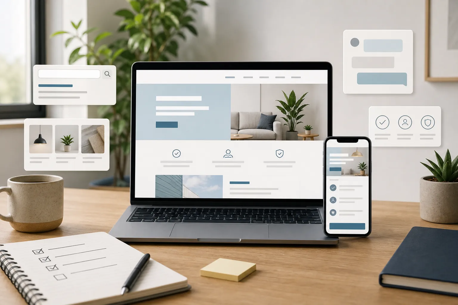
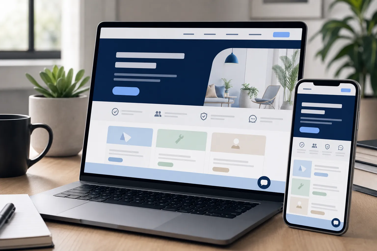
The first screen should answer four questions quickly: what do you do, who is it for, why should the visitor trust you enough to continue, and what should they do next? If the visitor has to scroll, open the menu or translate a poetic slogan before the offer makes sense, the page is already leaking attention.
This matters even more on mobile. Many customers are comparing options on phones, in between other jobs, with very little patience. A strong mobile first screen has readable text, a clear action, clean spacing, useful proof and no awkward overlay covering the thing the visitor came to tap.
The article on the small-business website checklist goes deeper on launch checks, but the principle is simple: the first screen must pass the stranger test. A stranger should know they are in the right place before their thumb gets bored.
Use pages that match how customers search and decide
A good website has enough structure for customers and search engines to understand it. That does not mean publishing hundreds of pages. It means giving important services, products, locations or use cases their own useful pages when people search and compare them separately.
For example, a visitor looking for small-business website design is not asking exactly the same question as someone looking for website maintenance services or small-business SEO services. Focused pages let each visitor land on a more relevant answer instead of forcing every decision through one general “Services” page.
Google's guidance on helpful content is a useful standard here: create information for people, not pages made mainly to attract search visits. A good page answers the real customer question, proves the business can help and points to the right next step. Google's people-first content guidance
Build trust into the route
Trust is not a badge dumped into the footer. It is the answer to the visitor's doubt at the moment that doubt appears. Can this business do the work? Is it real? What will it cost? What happens after I enquire? Has anyone else trusted it? Can I see a clear way to contact a human?
Useful trust signals include reviews, proof pages, examples, before-and-after visuals, named partnerships, real photos, pricing context, process clarity, policies, FAQs and contact details. The proof page and pricing page support that journey because visitors need reasons to believe before they act.
Put proof close to the claim. If a page says the service improves enquiries, show why that is believable nearby. If cost is the worry, give pricing context. If the visitor needs to know whether support continues after launch, link to website support services or website management services where the ongoing help is explained.
Keep navigation and calls to action boringly clear
Navigation is not the place to show off. A visitor should be able to find services, pricing context, proof, FAQs and the main next step without learning the owner's internal vocabulary. Labels such as “What we do”, “Pricing”, “Proof” and “FAQs” may not win a poetry prize, but they help people move. That is the point.
Calls to action should be just as direct. “Submit” tells the visitor nothing. “Get my free site audit”, “Request a quote”, “Book a call” or “Start building” tells them what happens next. That small clarity matters because visitors are often making a low-attention decision while comparing several businesses at once.
Do not make every button fight for attention. A good page has a primary action and a few supporting routes for people who need more confidence first. Someone ready to act should see the next step. Someone still comparing should be able to reach proof, pricing, FAQs or a related guide without feeling trapped in a sales tunnel.
Make the site easy to use, not just nice to view
Good design helps people move through the site without friction. Navigation should be obvious, buttons should look tappable, forms should be short enough to finish, headings should make scanning easy, and paragraphs should not stretch into giant walls of text. Pretty design that makes people work harder is not good design. It is just well-dressed friction.
Accessibility belongs in this conversation because accessible pages are usually easier for everyone. The Web Content Accessibility Guidelines explain how to make web content more accessible, with principles around content being perceivable, operable, understandable and robust. W3C's WCAG overview
Small-business owners do not need to memorise every technical criterion to make better decisions. Start with readable text, strong contrast, useful alt text, sensible headings, labelled forms, keyboard-friendly controls and buttons that can be tapped comfortably on a phone. These choices help accessibility, usability and conversion at the same time.
Make speed and mobile quality boringly reliable
A good website should load quickly enough that visitors do not start negotiating with their patience. Slow pages lose attention, especially on mobile. Heavy images, bloated scripts, awkward pop-ups and unstable layouts all create friction before the visitor even evaluates the offer.
Use a practical speed check such as Google PageSpeed Insights to find obvious problems, but do not treat a perfect score as the whole job. A fast page with vague copy still fails. A clear page that takes too long to load also fails. The useful target is a page that feels quick, readable and easy to act on. Google PageSpeed Insights
Mobile quality also means checking real layouts, not just assuming the site “is responsive”. Review menus, buttons, images, forms, cookie choices, sticky bars, line breaks and the first screen. Small mobile annoyances become big conversion leaks because phone visitors have less room and less patience.
Connect content to action
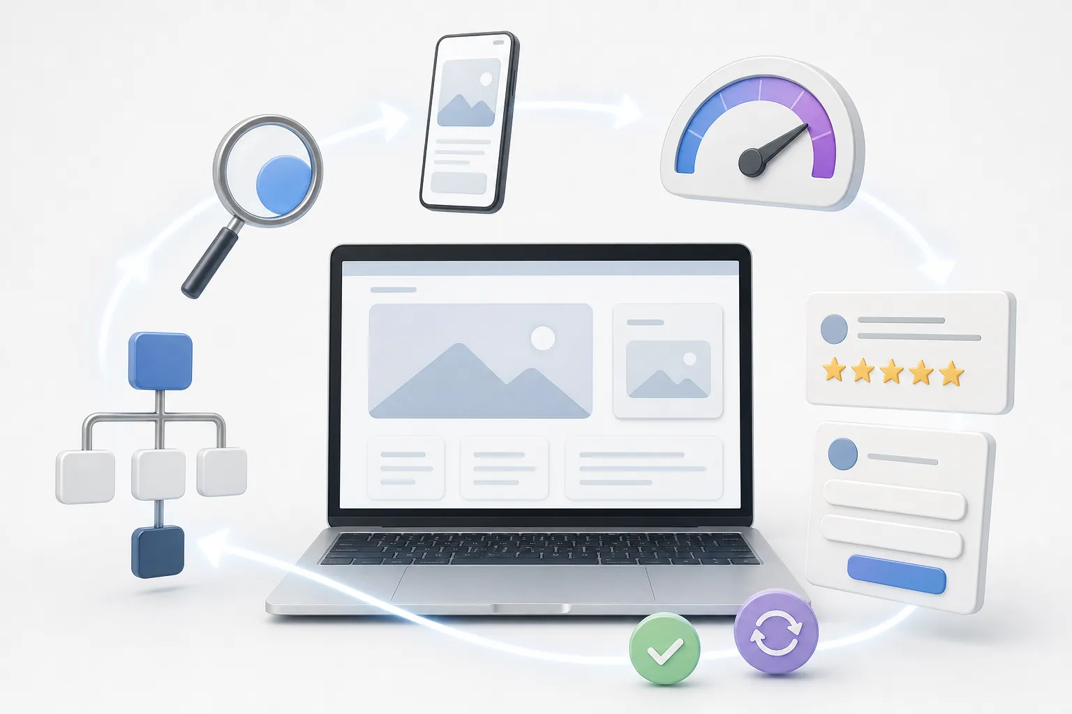
A good website helps different types of visitors move forward. Some are ready to buy. Some are comparing options. Some are researching a problem before they trust anyone. The site should have pages for those stages and links between them that feel useful in the moment.
A guide about increasing website traffic should naturally point towards the growth offer. A guide about website costs should help readers reach pricing, support and managed-service pages. A page about conversion should link to proof and the audit. Good internal links are signposts, not confetti.
This is where blog content becomes commercially useful. It catches research demand, earns trust, and then gives readers a sensible route into the pages where they can act. Articles that never connect to a next step may get page views, but they do not help the business much. Traffic without direction is just noise with a graph.
Measure what happens after launch
A website is not good forever because it looked good on launch day. Services change, customer questions change, competitors change and search behaviour changes. The site needs measurement so the owner can see which pages are being found, which pages are earning action and which pages are being ignored.
Look beyond raw visits. Track whether visitors run the audit, read proof, view pricing, start a build, enquire, book, call or move from a guide to a service page. Search Console can show impressions and clicks; analytics can show visits and important actions. Together, those signals tell you what to improve next.
For example, a service page with impressions but few clicks may need a stronger title and description. A page with clicks but no enquiries may need clearer proof, better pricing context or a more obvious action. A blog post that gets visits but sends nobody to a related service page may need better internal links. The data does not make the decision for you, but it stops every improvement being a guess.
This is the difference between a one-off website and a growth asset. A one-off site is launched, admired and slowly forgotten. A good site is checked, improved and connected to real customer behaviour. Less glamorous, yes. Also much less silly.
Use this practical checklist
- The first screen says what you do, who it is for and what happens next.
- Key services have focused pages with proof, useful answers and clear actions.
- The mobile version is readable, tappable and not covered by awkward banners.
- Visitors can find pricing clues, proof, FAQs, policies and contact routes easily.
- Important pages are linked, indexable and written around real customer questions.
- Analytics and search data are used to improve weak pages after launch.
How 118 118 Sites helps
Most owners do not need another platform to learn. They need a website that is clear, findable, trusted and kept up to date without turning the business owner into a part-time web team.
118 118 Sites starts with the audit, rebuilds the missing structure, then keeps improving the site with practical growth work: clearer pages, useful articles, stronger internal links, technical checks, proof, mobile polish and better routes from search to enquiry.
If you want to know whether your current website is doing the job, run the free site audit. It shows where the site is being missed, misunderstood or ignored before you spend more time polishing the wrong thing.
Frequently asked questions
What makes a good website for a small business?
A good small-business website makes the offer clear, earns trust quickly, works cleanly on mobile, gives visitors a simple next step, and keeps improving after launch. It should help the right customer understand, believe and act without needing to decode vague wording or hunt for contact details.
Is good website design mostly about how the site looks?
No. Visual design matters, but looks are only one part of the job. A good website also needs clear copy, useful pages, fast loading, accessibility basics, strong proof, working forms, helpful internal links and measurement. A pretty site that does not bring enquiries is just expensive wallpaper.
How often should a small-business website be improved?
Review important pages at least every few months, and sooner when services, prices, locations, proof or customer questions change. New sites need closer attention because early search and visitor data show which pages are being found, ignored or misunderstood.
What should I fix first on a weak website?
Start with the page closest to winning the customer. Make the first screen clear, check the mobile experience, add proof near the call to action, test the enquiry route and make sure the page can be found from the rest of the site. Fix the route to revenue before polishing low-impact details.