A website checklist is useful only if it checks the things that help the business win customers. Typos matter. Broken links matter. But the bigger question is whether a first-time visitor can understand the offer, trust the business, find the next step and act without needing a detective badge.
Most launch checklists treat the website like a box of parts: domain, pages, images, links, forms, analytics, done. That is tidy, but small-business websites do not fail because one box was unticked. They fail because the homepage is vague, the service pages are thin, the mobile version hides the button, proof appears too late, or nobody checks what happens after launch.
Use this checklist in a more commercial order: first make the site clear, then make it trustworthy, then make it findable, then make the action route work. Google's own advice is to create helpful, reliable, people-first content, not pages built only to collect search visits. That is a good standard for a business site too. Google's people-first content guidance
1. Check the job of the website before the design
Before checking colours, layouts or clever effects, write down the one job the website must do. For most small businesses, that job is one of these: earn calls, collect quote requests, drive bookings, sell a product, get people through the door, or build enough trust that someone chooses you over another option.
This matters because a page trying to do five jobs usually does none of them clearly. A homepage that asks visitors to read the story, view the gallery, follow on social, join a newsletter, book a call and browse every service at once is not customer-friendly. It is a noticeboard with ambitions.
For 118 118 Sites, the main route is deliberately simple: help owners check whether their current site can be found, then show a faster path to a site that keeps improving. That is why the free site audit appears early, while How it works explains the decision for people who need more context.
2. Make the first screen pass the stranger test
A stranger landing on the site should know what the business does, who it helps, where it works when location matters, and what the next step is. They should not need to decode a slogan, open the menu or scroll past a mood-setting paragraph before the offer becomes obvious.
Check the mobile first screen, not just the desktop version. Many owners review their website on a laptop because that is where they work, while customers are comparing options on phones. If the mobile opening hides the main action, buries the service area or crops the image awkwardly, the page can lose the visitor before the content gets a chance.
Strong first screens usually have a clear headline, one plain supporting sentence, one primary action and enough proof or specificity to keep the visitor reading. Decorative confidence is not enough. The page has to answer the visitor's quiet question: am I in the right place?
3. Check that the right pages exist
A small-business website does not need a huge page count, but it does need the right pages. At minimum, check the homepage, key service pages, proof or reviews, pricing or cost guidance where possible, FAQs, contact routes and legal pages. If local search matters, the site should also make services and areas served clear.
Separate important services when customers search for them separately. A single “Services” page can be too vague if one visitor wants website design, another wants website maintenance and another wants help getting traffic. Focused pages such as small-business website design, website maintenance services and small-business SEO services help visitors and search engines understand the exact offer.
Also check whether any useful old pages have disappeared during a redesign. If an old page earned traffic, links or enquiries, do not casually delete it because the new navigation looks neater without it. Keep the useful content, improve it, or send the old address to the closest relevant new page.
4. Put proof where the visitor hesitates
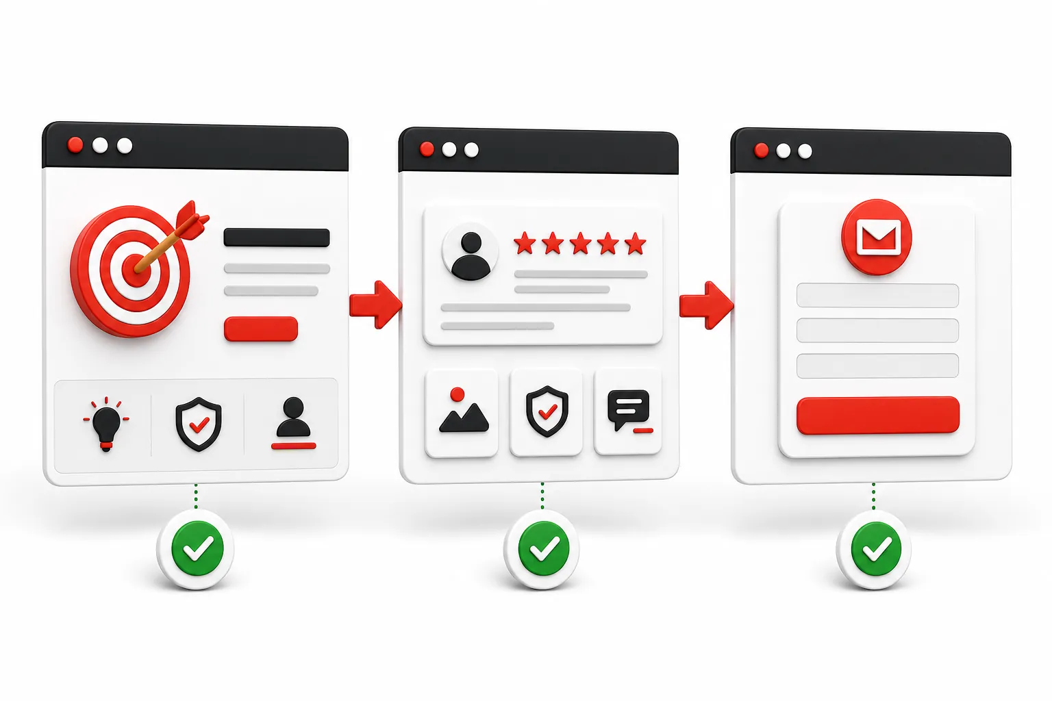
Trust is not one section at the bottom of the site. It is the answer to every moment where a sensible buyer might pause. Can this business do the work? Is it real? What will it cost? What happens after I enquire? Has anyone else trusted it? Is there a clear way to contact a human?
Useful proof includes reviews, named examples, before-and-after visuals, accreditations, clear process steps, pricing context, guarantees, real photos, privacy links, policies, partner logos when they are genuine, and FAQs that answer actual objections. Trust signals reduce uncertainty; they are not badges sprinkled on a page for decoration. Trustmary's definition of trust signals
Check proof close to the claim. If the page says the service improves enquiries, show why that is believable nearby. If cost is likely to be the worry, link to pricing. If brand credibility matters, link to proof. Do not make visitors go hunting for reasons to believe you.
5. Test every action route like a customer
Click every important button, form, menu item, phone link, email link, booking link and social link. Do it on mobile and desktop. A broken enquiry form is not a small issue; it is a silent sales blocker. A button that looks right but lands on the wrong page is even more annoying because nobody sees it from the owner's side.
Keep the action labels specific. “Submit” is weak because it tells the visitor nothing. “Get my free site audit”, “Book a call”, “Request a quote” or “Start building” is clearer because it describes the result of the click. Small wording choices reduce doubt at the exact point where hesitation can cost the enquiry.
Also check what happens after the action. Does the form confirm submission? Does the email go to the right inbox? Does the booking route show the right availability? Does the audit or quote page feel connected to the page that sent the visitor there? Conversion is a route, not a button.
6. Check mobile readability and speed
The mobile version needs its own review. Check text size, line length, image crops, menu behaviour, form fields, sticky bars, cookie choices, tap targets and whether the main call to action is still visible when the page first loads. A desktop page squeezed onto a phone is not a mobile experience. It is a complaint waiting to happen.
Use a speed check to catch heavy images, slow scripts and obvious performance problems. Google PageSpeed Insights is a useful starting point because it checks the real URL and highlights mobile issues. Do not chase a perfect score while the message is vague, but do fix slow, clumsy pages that make visitors wait. Google PageSpeed Insights
Speed and clarity work together. A fast page that says nothing useful will still fail. A persuasive page that loads slowly will lose impatient visitors. The checklist needs both: quick enough to use, clear enough to choose.
7. Make the site ready to be found
Check that every important page has a specific title, a useful description, one clear main heading, descriptive internal links and content that matches a real customer question or buying need. If a service page could belong to any business in any industry, it is too vague to be a strong search result.
Make sure search engines can crawl the site. Important pages should not be blocked, password-protected, hidden from navigation or missing from the sitemap. Google Search Console helps owners see indexing, impressions, clicks and page issues after launch. Google Search Console
Internal links matter here too. A guide about increasing website traffic should naturally point readers to the pages that explain the growth work. A post about website conversion rate should support proof, pricing and service pages. Good links move people forward and help the site make sense as a whole.
8. Check accessibility basics
Accessibility is not just a compliance box. It makes the site easier for more people to use. Check that text has enough contrast, images have helpful alternative text when they carry meaning, forms have clear labels, links are understandable, buttons can be reached with a keyboard, and headings follow a sensible order.
The Web Content Accessibility Guidelines are the main standard used to judge accessible web content. You do not need to memorise every criterion to make a better site, but you should respect the basics: readable text, usable controls, meaningful structure and no design choices that shut people out. W3C's WCAG overview
Accessibility often improves conversion too. Clear labels, strong contrast, readable paragraphs and obvious buttons help everyone, including tired visitors on phones who are comparing three businesses between other jobs.
9. Check privacy, cookies and legal wayfinding
Visitors should be able to find the policies that explain how the site handles personal information and cookies. If the site uses analytics, advertising pixels, enquiry forms, bookings, payments or newsletter sign-ups, the legal pages and consent choices need to make sense for the business and market.
This is not the place for guesswork or copy-and-paste bravado. The checklist should confirm that privacy, cookie and terms pages exist where needed, are linked from the footer, and match what the site actually does. If legal wording needs judgement, get proper advice rather than letting a website checklist cosplay as a solicitor.
From a customer point of view, legal wayfinding is also trust work. A real business makes it easy to understand who is behind the site, how to contact them and how personal data is handled. Hiding those basics makes the site feel less serious.
10. Set up measurement before judging success
A website cannot improve sensibly if nobody can see what visitors do. Set up analytics before launch, then check the actions that matter: audit starts, quote requests, bookings, pricing views, proof-page visits, form submissions or calls. Raw page views are useful context, but they are not the same as growth.
Watch the route from attention to action. If a blog post gets visits but nobody moves to a related service page, the internal links or next step may be weak. If pricing gets views but no enquiries, the offer may need more proof or clearer value. If the homepage gets impressions but few clicks, the title and description may need work.
This is the reason daily growth work exists. Launching a site is not the finish line. It is the point where real data starts showing what should be improved next.
Use this practical checklist
- The first screen says what you do, who it is for and what to do next.
- Every important service has a focused page with proof and a clear action.
- The site works cleanly on mobile, including menus, forms and buttons.
- Reviews, examples, pricing clues and contact details appear where doubt starts.
- Search engines can crawl the pages, read useful titles and find the sitemap.
- Analytics and enquiry routes are checked after launch, not forgotten.
How 118 118 Sites helps
Most owners do not need another generic website checklist. They need the site checked against what actually brings customers: visibility, clarity, trust, mobile usability, working action routes and steady improvement after launch.
118 118 Sites starts with the free audit, rebuilds the missing structure, then keeps improving the site with useful pages, clearer links, stronger proof and practical fixes based on what search engines and visitors are doing. The point is not just to go live. It is to become easier to find and easier to choose.
If you want to know which boxes your current site is missing, run the free site audit. It gives you a plain-English view of the gaps before you spend more time polishing a site that may still be leaking enquiries.
Frequently asked questions
What should a small-business website checklist include?
A useful checklist should cover the job of the site, core pages, mobile clarity, trust signals, contact routes, search readiness, accessibility, privacy basics, analytics and the checks that happen after launch. The point is not to tick every possible web task. It is to make sure the site can be found, understood, trusted and acted on.
Should I check the website before or after it goes live?
Do both. Before launch, check the essentials that could cost enquiries immediately: broken links, forms, mobile layout, page titles, contact details, privacy links and tracking. After launch, check what visitors and search data show, then improve the pages closest to bringing in customers.
How often should a business website be reviewed?
Review the important pages at least every few months, and sooner after a service, price, location, team or offer changes. New sites need closer attention because early data often shows which pages Google is discovering, which pages visitors read, and where people stop before enquiring.
Is a website checklist enough to get more enquiries?
A checklist helps remove obvious leaks, but enquiries usually grow through ongoing improvement. The site still needs clearer pages, useful content, stronger proof, better internal links and regular checks against real visitor behaviour. A good checklist is the start of the loop, not the whole job.