A website redesign process is the work of deciding what the new site needs to do before anyone starts making it look newer. For a small business, that means protecting the pages that already bring attention, making the offer easier to understand, and giving customers a cleaner route to enquire, call, book or buy.
That order is worth taking seriously. A slick redesign can still be a bad business decision when it removes useful service pages, hides proof, breaks old links or keeps the same vague message in a more fashionable layout. The new website should be better because it makes customer decisions easier, not because somebody discovered rounded corners.
Most redesign guides follow a similar broad sequence: review the current site, set a purpose, understand the audience, plan the structure, build and test, then monitor what happens after launch. Google adds an important practical point for any site where URLs change: map old pages to their closest new equivalents and use permanent redirects before the move. Google's site-move guidance
1. Start with the business problem, not a design mood board
Begin by naming what the current website is failing to do. Is it hard for customers to understand the main service? Does the site look untrustworthy on a phone? Are useful enquiries falling through a confusing form? Is the business now offering different services, serving a new area or charging in a different way? Those are redesign problems worth solving.
“We need something more modern” can be part of the conversation, but it is not a brief. Decide what success should look like in customer terms: more qualified enquiries, clearer service choices, better local trust, more booked appointments, fewer abandoned checkouts or a site the team can actually keep current. That decision shapes every page, image and call to action that follows.
If the real issue is uncertain, get a clear picture first. A free site audit is a sensible starting point because it separates a structural problem from weak copy, missing proof, mobile friction or a page that simply has no useful route to an enquiry.
2. Decide whether you need a refresh or a full redesign
A refresh improves what is already there: tighter copy, better images, new proof, clearer calls to action, a mobile tidy-up or a few stronger service pages. A redesign changes the underlying structure: navigation, page set, customer journey, content model, platform or brand presentation. They are different levels of disruption, so they deserve different amounts of planning.
A refresh can be the better commercial choice when the site has useful pages and a sound structure but looks dated or leaves questions unanswered. A full redesign is more justified when the current site is hard to update, difficult to use on mobile, missing important services, built around the wrong audience or so cluttered that customers cannot find the next step. Do not demolish a working shop just because the sign needs repainting.
3. Find the pages and signals worth protecting
Before anyone deletes, merges or renames pages, make an inventory of the current site. Include pages that get visits, enquiries, search visibility, links from other sites, recurring customer questions, staff referrals or useful local information. A plain-looking page can still carry years of trust and discovery value.
This review should cover more than traffic. Look at enquiry forms, phone taps, bookings, product purchases, emails, popular FAQs, important reviews and the pages sales staff send to prospects. Then mark each page as keep, improve, merge, replace or retire. That creates a proper content decision rather than a hopeful sweep of the delete key.
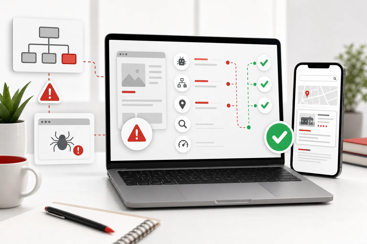
The existing website audit checklist is useful for this stage. It helps separate urgent leaks, such as broken forms and weak mobile layouts, from cosmetic work that can wait until the customer path is sound.
4. Plan the new page map before designing individual screens
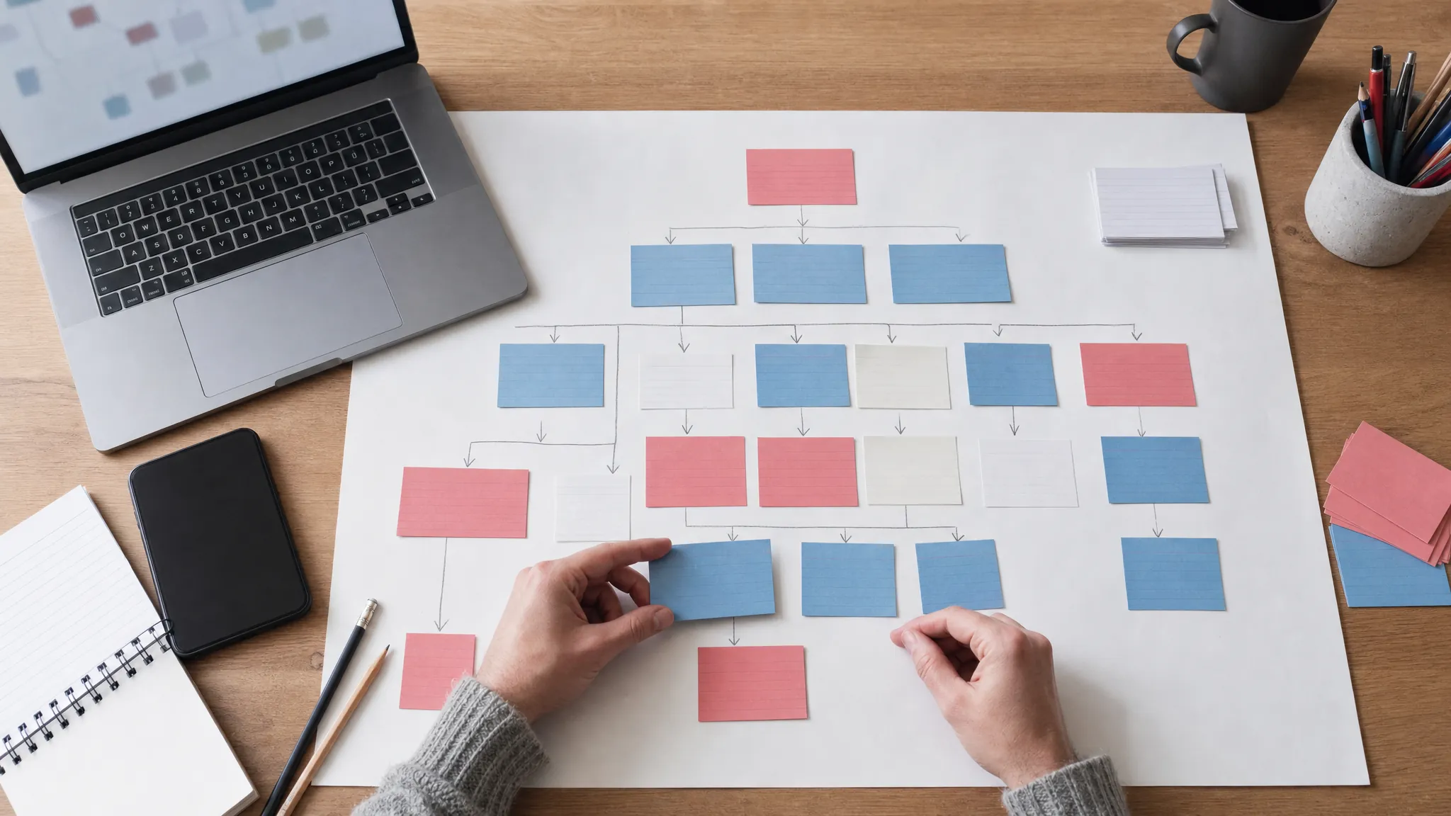
A page map is simply a clear picture of what the finished site needs to contain and how a customer moves through it. Most small businesses need a focused homepage, clear service pages, proof, FAQs, a contact or quote route, legal links and supporting guides where customers have research questions before they are ready to speak to someone.
Start from the customer's decision. Someone landing on a service page should be able to see what is offered, who it suits, why the business is credible, what happens next and how to act. Someone comparing providers may need pricing clues, proof and answers to common objections. Someone researching a problem may need a useful guide that leads naturally to the relevant service. Build pages around those jobs rather than around whatever headings were in the old navigation.
This is where a good redesign becomes a better sales route. The 118 website redesign service and small-business website design pages are separate because readers arrive with different needs. One generic “what we do” page may look tidy, but it makes customers work too hard to find the right answer.
5. Map old addresses to new pages before launch
When a page changes address, make a simple old-to-new map before the new site goes live. Match every valuable old URL to the closest relevant new page. An old plumbing page should lead to the new plumbing page. An old pricing page should lead to current pricing. A useful guide should lead to its updated equivalent, not a generic homepage.
This protects visitors first. Someone following an old bookmark, a link in an email or a saved social post should still land somewhere useful. It also gives search engines a clear signal that the new page continues the old page's job. Google specifically recommends preparing this mapping, setting redirects and monitoring old and new URLs during a site move. Its redirect guidance explains why this is more reliable than sending everything to the homepage and hoping for the best.
Not every old page needs saving. Thin duplicates and dead-end pages can be retired. The sensible test is whether the page has a real customer purpose, useful visibility, links, leads or context worth preserving. Keep what is useful, improve what is unclear and remove only what genuinely has no job.
6. Write the content before polishing the interface
Design and copy need to work together, but the message should not be an afterthought. If the current site is vague about what the business does, a new layout will not rescue it. Write the main promise in plain language. Name the service. Explain who it helps. Add the proof a cautious buyer needs. Make the next step specific and easy.
Start with the first screen and the priority service pages. Then add the supporting material: FAQs where people hesitate, case studies or reviews where belief is needed, pricing context where uncertainty slows decisions, and useful articles where customers need time to research. Google's people-first content guidance is a helpful standard here: pages should give the reader enough useful information to meet their goal, rather than trying to look impressive while saying very little. Google's guidance on helpful content
A practical way to test the draft is to ask whether a first-time visitor can answer four questions without scrolling in circles: what is this, is it for me, why should I trust it, and what do I do next? If the answer is no, the site needs clearer content before it needs another design flourish.
7. Build the new site around real use, especially on mobile
Most business owners review a redesign on a large screen. Many customers do not. They use a phone between jobs, on a train, at home late at night or while trying to compare a few options quickly. Check the mobile version throughout the build, not as a ceremonial last step.
Review menus, tap targets, forms, image crops, text length, sticky bars, cookie choices and calls to action. Check whether the page still feels calm and obvious when the screen is narrow. Accessibility belongs in the same review: readable contrast, sensible heading order, clear form labels, keyboard-friendly controls and meaningful image descriptions where an image carries information. The W3C's WCAG overview is a reliable reference for those basics.
8. Test every route to a customer action before launch
Before launch, work through the website as someone who does not know the business. Can you understand the offer quickly? Can you get to the right service? Do the proof and FAQs answer the obvious doubts? Can you make contact, request a quote, call, book or buy without a dead end?
Test the dull but expensive things too: enquiry forms, confirmation messages, phone links, booking routes, checkout steps, footer links, privacy and cookie links, 404 pages, old URLs and internal links. These details are not glamorous, but they are exactly where a new site can quietly lose a ready customer.

9. Launch, monitor and improve instead of declaring victory
Launch day is the start of the evidence, not the end of the job. Watch whether key pages are reachable, whether old links arrive at the right new pages, whether forms work and whether the pages closest to revenue are being seen and used as expected. A careful launch plan gives the business a short list of checks rather than waiting for an unhappy customer to discover the problem.
Some movement is normal after a major change. The useful response is to look for the cause: a missed old page may need routing correctly, a service page may need a clearer title, a new page may be too thin, or the enquiry route may need more proof. Keep the decisions tied to real evidence. Avoid changing everything again because the first week felt nervous.
In the first few weeks, keep a short launch log. Note the pages that were changed, any old addresses that people still use, enquiries or calls that arrive, and anything the team hears from customers. Check the important pages on a phone as well as a laptop. A missed contact button, an awkward cookie choice or a page that sends the wrong kind of enquiry is easier to fix when it is noticed early. This is not bureaucracy for its own sake; it turns launch feedback into a clear order of work instead of a collection of half-remembered worries.
This is the advantage of a website that keeps improving. The Grow traffic approach uses what visitors and search visibility reveal to choose the next useful change. The goal is not one perfect launch. It is a site that gets clearer, stronger and more useful as the business learns.
Use this website redesign process checklist
- Name the business result the redesigned website must improve.
- List every current page with traffic, enquiries, links or useful search visibility.
- Map each valuable old address to its closest new page before launch.
- Plan core pages around real customer questions, proof and clear next steps.
- Test the finished site on phones as well as larger screens.
- Check forms, calls, bookings, policy links and old page addresses before launch.
- Monitor key pages and enquiry routes after launch, then fix what the data exposes.
How 118 118 Sites helps
118 118 Sites is designed for owners who need the website work handled in the right order. Start with what is holding the current site back, protect the pages that matter, rebuild the customer journey and keep improving the result after launch. That avoids the classic mistake of paying for a prettier site that still leaves the business invisible or unclear.
Start with the free site audit, then compare the website redesign service, pricing and proof. The decision should leave you with a site that customers can understand, trust and act on, not just something nicer to look at.
Frequently asked questions
What are the steps in a website redesign process?
A sensible website redesign process starts with the business goal and a review of the current site. It then maps valuable existing pages, plans the new structure and content, builds and tests the new site, redirects moved pages, and monitors the results after launch. The order matters because a redesign can lose useful traffic and enquiries when the planning happens after the design work.
How long does a small-business website redesign take?
The timeline depends on the number of pages, the quality of the current content, the decisions that need approval and whether the site has bookings, ecommerce or complex integrations. A small brochure-style site can move quickly once the plan is clear, but the important work is not just drawing the new screens. It is agreeing the message, protecting useful pages and checking the finished customer journey.
Can a website redesign affect Google rankings?
Yes. Rankings can move when useful pages disappear, URLs change without relevant redirects, content becomes thinner, internal links break or the new site cannot be crawled properly. A planned redesign reduces that risk by mapping old pages to their closest new equivalents, keeping valuable content and monitoring the key pages after launch.
Should I redesign my website or improve the existing one?
Improve the existing site when the main structure works and the problem is limited to a few pages, weak copy, mobile issues, proof or calls to action. Redesign when the site no longer reflects the business, is hard to use or update, has the wrong page structure, misses important services or cannot support the customer journey you need.