A website brief template is not homework for the sake of it. It is the short document that turns “we need a better website” into a job someone can understand, price and deliver. A good brief helps a small business get a clearer proposal, avoid expensive guesswork and keep the finished website focused on customers rather than personal taste.
You do not need to know how to design or build a website to write one. In fact, the most useful brief does not pretend to be a technical specification. It explains the business problem, the people the site needs to help, the decisions those people need to make and the practical constraints around the project. The web team can then decide how to solve it.
Use the template below before you ask for quotes, start a redesign or decide whether your current website needs a refresh. It will not make every project friction-free, because humans remain impressively inventive at changing their minds halfway through. It will make the important decisions visible early, when they are cheaper to deal with.
What is a website brief template?
A website brief template is a repeatable set of questions that helps you define the job before someone starts designing pages. It should cover the commercial goal, target customers, important pages, content, proof, features, timeline, budget and how the site will be judged after launch.
The best brief gives direction without trying to dictate the answer. “We need more qualified enquiries for kitchen extensions in Kent” is useful direction. “Put a blue button in the middle and make it modern” is a preference wearing a tiny hard hat. Design examples can be helpful, but they should support a clearer explanation of what the business needs the website to do.
This matters because a website is rarely just a brochure. It may need to explain services, earn trust, give prices or pricing clues, support local discovery, collect enquiries, show proof, answer common questions and work cleanly on a phone. The brief gives those jobs an order instead of leaving the project to become a long argument about fonts.
Website brief template: copy this structure
Open a document and use these sections as headings. Keep the answers plain. Short, honest answers are more valuable than a glossy document that says the site should be “innovative” and “user-friendly” without explaining a thing.
| Section | What to write | Useful prompt |
|---|---|---|
| Business goal | The one result the website should help the business improve. | What should be easier or more valuable once this site is live? |
| Customers | The audiences that matter most and the questions they arrive with. | Who is the site for, and what do they need to understand before acting? |
| Offer and proof | Main services, products, locations, experience, reviews and case studies. | What makes a sensible customer choose you rather than wait or compare? |
| Pages and content | Pages to keep, create, merge or retire, plus who supplies the words and images. | What should a visitor be able to find without asking your team? |
| Features and routes | Enquiry forms, bookings, ecommerce, logins, maps, newsletters or connected tools. | What does a visitor need to do, and where should that action go? |
| Practical limits | Budget range, deadline, stakeholders, approvals and known risks. | Who decides, what cannot slip, and what needs protecting during the change? |
1. Start with the business result, not the design mood
The first part of the brief should answer one blunt question: what is this website meant to improve? For a local service business, it may be more estimate requests. For a consultant, it could be better-qualified discovery calls. For an online shop, it could be fewer abandoned baskets and more repeat orders. For a recruitment firm, it may be attracting both candidates and hiring companies without confusing either.
Choose one primary result and a small number of supporting results. Saying “more traffic, more sales, a modern brand, better recruitment, more reviews and fewer support calls” is not impossible, but it is a messy brief. A good web team can still help with several outcomes, yet it needs to know which decision wins when priorities compete.
Be specific about the action that matters. “More enquiries” is better when you add what a useful enquiry looks like. A builder may want larger extension projects rather than emergency jobs. A therapist may want booked consultations. A retailer may want online orders. This gives the new site a commercial job rather than a vague instruction to look more professional.
2. Describe your best customer and their decision
Your website should not try to speak to everyone in the same breath. Describe the people most likely to become good customers: what they need, what they worry about, what they compare and what they need to see before they make contact.
Include the language they use. A customer may look for “loft conversion specialists”, “bookkeeping for contractors” or “wedding photographer in York”, not the internal label your team uses. That does not mean stuffing phrases everywhere. It means the pages should explain the real service in words a customer recognises.
Write down the objections too. Is the buyer worried about cost, quality, availability, location, reliability, experience or disruption? The site should answer these questions with clear information, proof and sensible next steps. That is more useful than making the visitor hunt for reassurance after they have already started doubting you.
3. List the pages, information and proof the site needs
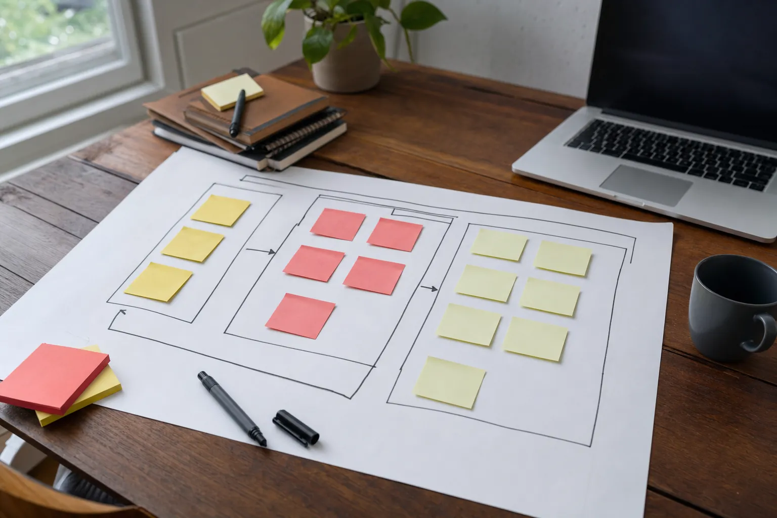
Next, list what a visitor should be able to find. Start with the obvious: homepage, core services or products, about information, contact route, FAQs, proof and legal links. Then add what is specific to your business: service areas, project galleries, pricing guidance, booking details, delivery information, accreditations, team profiles or resource guides.
Do not simply copy the existing navigation. A new website is a chance to fix the structure if it is confusing. Mark each current page as keep, improve, merge, redirect or retire. That protects the useful material while making it clear where a stronger page is needed. If the old site already has valuable pages, changing every address without a plan can cause avoidable disruption; Google's site-move guidance explains why mapping changed addresses matters.
Be honest about content ownership. Who will supply service details, prices, photos, testimonials, product data, policies and approvals? A website project slows down when the agency is waiting for information nobody has been asked to gather. If help with copy, photography or product setup is needed, put it in the brief rather than discovering it once the first design is already on screen.
4. Make a simple content inventory before anything is thrown away
Gather the real materials the site needs: existing pages, brochures, images, price lists, reviews, case studies, product information, frequently asked questions, policies and any sales material your team already uses. This is the raw material for a more convincing site.
A content inventory also exposes gaps. If a service is important but nobody can explain its scope, price range or proof, that is not an agency problem to hide with a stock photo. It is a business decision that needs an answer. Flag it early so the project can include the right conversations and research.
Keep accessibility in the inventory too. Useful image descriptions, readable documents, clear headings and understandable forms are not optional finishing touches. The WCAG overview sets out the recognised accessibility principles: content should be perceivable, operable, understandable and robust. A brief does not need to recite the standard, but it should identify any audience needs, essential documents and customer journeys that must work well for everyone.

5. Name the functions the website must have
This section is about outcomes, not technical jargon. List what the visitor needs to do: request a quote, book an appointment, buy a product, upload a document, find a local branch, join a mailing list, use a calculator, log in, download a brochure or call the business.
Then list the tools that must connect to the website, such as a booking system, payment provider, stock system, customer database, email platform, review platform, map or analytics account. Include the name of the tool and who owns access. Do not try to solve the integration in the brief. The purpose is to make sure it is considered before a quote quietly excludes it.
A useful brief also names the enquiry route. When someone completes a form, who receives it? What information is needed to make the enquiry useful? Does the business need a confirmation email, a call booking or a handoff to another system? These small details are where a website becomes an operational tool instead of a decorative leaflet.
6. Set the budget, timeline and decision process honestly
You do not need a precise budget before you ask for a proposal, but a realistic range saves time. A designer cannot recommend a sensible scope if the budget is kept secret until the final conversation. State whether the figure includes copy, imagery, support, migration, ecommerce setup, ongoing maintenance and marketing work, or whether those are separate.
Include the deadline only when you can explain why it matters. A seasonal launch, event, move, product release or expiring platform contract is useful context. “As soon as possible” is understandable but not a plan. The same applies to approvals: name the people who can sign off content, design and budget, and agree how quickly they will respond.
Finally, write down what must not break during the project. That may include existing enquiries, important pages, paid campaigns, a booking route, a customer login, a known high-performing address or the business's ability to update urgent information. A well-run redesign protects these routes while making the whole site clearer.
7. Agree how the finished website will be checked
A site is not ready because it looks fine in a desktop screenshot. The brief should ask for checks on mobile, forms, buttons, maps, payments, booking routes, key pages, link paths, page speed, accessibility basics and the content that customers need to make a decision.
Mobile deserves its own line in the brief. Google uses the mobile version of content for indexing and ranking, so the mobile page should not be a cut-down afterthought. Google's mobile-first indexing guidance is a useful reminder that the core information and customer routes need to work on the smaller screen where many people will first compare you.
Decide what happens after launch as well. Who checks that enquiries arrive? Who watches the important pages? Who owns updates? How will the business learn which questions visitors search for and where the site is losing interest? A website that is reviewed and improved can keep earning its place. One that is launched and ignored tends to become a very expensive old leaflet.
Use this website brief checklist
- Write one clear business result the website needs to support.
- Describe the customers you most want to help and the question they arrive with.
- List the services, products, locations and proof the new site must make easy to find.
- Identify the existing pages, content and addresses that must be protected or improved.
- Name the required features, integrations and enquiry routes without guessing a technical solution.
- Set a realistic budget, decision-maker, deadline and launch risks before comparing quotes.
- Agree how the website will be tested and what a useful result looks like after launch.
How 118 118 Sites helps
118 118 Sites starts with the business job, not a template. The free site audit helps identify where the current website is weak, while the small-business website design service and website redesign serviceturn those priorities into clearer pages, stronger proof and easier customer actions.
The work does not stop at launch. The site can keep improving through clearer content, useful guides, stronger links, technical checks and reviews of the pages closest to an enquiry. That gives a small business a practical alternative to buying a redesign and then hoping it stays useful by itself.
Frequently asked questions
What is a website brief?
A website brief is a plain-English plan for a new website or redesign. It explains what the business needs the site to achieve, who it is for, what content and features it needs, what should be preserved, and how the finished site will be judged.
How long should a website brief be?
It only needs to be as long as the decisions require. A straightforward small-business brief may be two or three well-considered pages. A larger site with ecommerce, integrations, several audiences or a complex migration needs more detail. Clear answers matter more than a polished document.
Do I need to choose the design before writing a website brief?
No. Explain the business, customers, priorities and practical needs first. You can share examples of websites you like, but the brief should not prescribe every design decision before the real problem has been understood.
What should I ask a web designer after sending a brief?
Ask what they understand the main goal to be, which pages they would prioritise, what content they need from you, what is excluded, how they will test the site, and what happens after launch. The useful answer should be specific to your business rather than a generic sales pitch.